This discussion is not intended to re-flog the surely dead PC versus Mac horse. It attempts to contrast marketing communications based around unified form — characteristic of Apple — against that which promotes unified function, which I would argue characterizes Microsoft’s latest Windows push. It seems important as one message is closed, and ultimately leads to a dead-end since it cannot be borne out by users’ experience. The other message is extensible, and can more readily adapt to developing requirements for new function.
A client said she was considering replacing her Windows notebook; she enjoyed using her iPhone and her iPad, so she would probably go with a Mac this time round because then everything would work in the same way, with which she is now familiar. This assumption – that familiarity with one device from Apple will render a common experience with any other – represents a small but significant marketing communications triumph for the manufacturer (even though it may be undermined by the first ineffective swipe at the unresponsive MacBook screen).
Apple’s message is simple: great design that pervades everything it makes and provides a single, unifying experience for its users. So powerful is that message, that it shapes the medium and becomes the defining characteristic of the company’s presentations, commercials, hardware, software, website, and even storefronts. So strong is Apple’s corporate culture of great design that it extends the corporation’s bounds to embrace well-healed consumers, welcoming them into a unified world of beautifully designed products with which you can do pretty much whatever you need to, in the elegant way they will teach you.
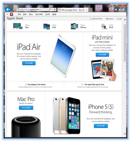 From the moment you step into http://store.apple.com/us you are presented with the entire family posing for a group portrait that places professional and consumer devices shoulder to shoulder in a show of corporate single-mindedness.
But the fact is, if you want a common experience for most of what you do with your phone, tablet, notebook, and desktop computer, you should use Windows devices, not Apple.
Microsoft has quietly subverted a commonly held view that because it operates on open and diverse hardware from a multitude of manufacturers, Windows is inherently hobbled in comparison to Apple’s hardware and software monopolith.
So if that’s the case, why is Microsoft relatively quiet about what sounds like a big win for the Windows brand in the battle for consumer opinion?
The answer may lie in another question: what does it mean when a company claims a unified, highly branded experience across all its products? In this case it certainly implies that you can only accomplish on any of them what you can accomplish on the least of them. So the frustrations with your phone, however powerful and glamorous a phone it may be, carry forward to your tablet, on to your PC, and potentially contaminate the very brand itself. When you think sophisticated corporate services, you are in danger of seeing a phone with wobbling 3-d icons, or a tablet in the hands of a child.
Maybe it’s best to keep unified experience messaging carefully corralled, in order to avoid the “lowest common denominator” effect of functional commonality across products.
Function Driving Form
Home versus business, service versus application, server versus device, consumer versus end-user – these are separate categories with specific requirements that may be incompatible.
Business requirements are almost entirely functional; data must be readily available, to be manipulated as business requires, quickly and efficiently. In this case, we work in whatever environment we must and use whatever tools may be required to get the job done.
Consumer requirements are more about form; devices must be attractive, and applications should be entertaining and readily understood. In this case, we do as good a job as we can within an environment with which we’ve become familiar.
I need the same basic interface on all my vehicles because they share the same set of well understood functions. Not so my kitchen appliances, and I don’t expect a sewing machine to become more familiar after I’ve mastered my lawn mower.
I’ll use the touch screen to read a document on my tablet but I’ll use a keyboard and mouse to construct such a document on my PC or MacBook. There’s only so much I can do with a spreadsheet on my phone, and the best that pinching and poking can offer my photo editing is often only “good enough”.
The breadth of required functionality chafes against the limitations of unified form, and the overall experience is unavoidably fragmented.
 This process of function driving form, and in the process always undermining messaging that stresses form, is clear when you consider the number of computer interfaces that are “photorealistic” representations of physical interfaces. There are aspects of those interfaces and the functionality they support to which the computer, however sophisticated in its unified user experience, can add no value and in many cases is an inferior alternative whose main qualification is only cheapness.
“As Simple as Possible, but Not Simpler”
The danger in Apple’s pervasive design mantra is that the brand, at first innovative and exciting with its message of a strongly unified, cross-device experience, is subject to the erosion of gradually revealed functional limitations and shortcomings that accumulate over time. And when that unified, highly branded consumer experience is the major source of growth, that erosion is more serious than a simple messaging misstep.
Growth stalls as form is perfected and the requirement for function, which meanwhile continues to develop and diversify, is ignored. The phone is now a pretty good camera. Once you’re familiar with taking reasonable pictures on your phone, you’ll quickly master creating half-decent presentations on your tablet; the environment is the same. You can even get simplified views of your stock portfolio, limited access to a spreadsheet, and a keyboard that’s not as bad as you thought it might be. Einstein’s limit on simplicity is breached even as the number of functions that can be reductively squeezed into this elegant form seems unlimited. Well, not completely breached; OS X on your MacBook is quietly very different from iOS on your phone and tablet, despite the strong family resemblances among hardware, applications, and overall appearance.
The powerful messaging that promotes commonality among devices and interfaces can only mitigate these functional shortcomings for so long, at which point that brand unification doesn’t necessarily hurt, but it definitely hinders. That’s when we tire of form and turn our attention back to function.
Pegs and Holes
 Current Windows commercials do show a common look and feel on phone, tablet, and notebook. But Microsoft doesn’t take that fight to Apple, because a win in the unified experience skirmish has a distracting downside for the larger battle over continued growth and relevance. Instead, Windows maintains a means for users to change its visual interface to suit its required function; at first criticized for an apparent dual personality, the latest revision of Windows is fast becoming appreciated for its adaptability to the user’s preferred workflow and to the specific task at hand.
Microsoft’s messaging hasn’t always seemed clear or effective, but in this case it’s smartly avoiding chasing Apple into a dead-end. Growth lies elsewhere. The question is whether you claim to provide extensible functionality to support diverse requirements, or whether– however impressively – your mission appears to be squeezing square-peg current and future requirements into a round-hole world of unified form.